Why Character Design Changes in AI Video
AI video generation doesn't store a "character object" between clips. It reconstructs the character from cues — your prompt, your reference images, the visual patterns it was trained on — fresh every time. This behavior is consistent with diffusion-based video generation systems described in video diffusion research, where each frame is generated through iterative denoising rather than persistent object memory.
This changes what good character design actually means. A strong character design for an animated character design workflow isn't just visually appealing — it's legible to a generation system. The traits that survive aren't always the most interesting ones. They're the most recognizable ones.
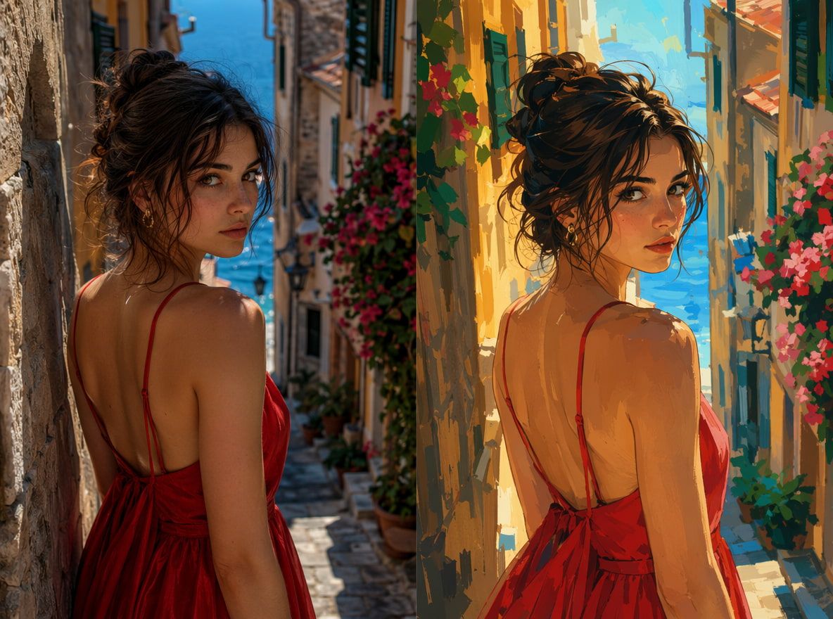
Three generation runs with the same reference image surface this fast. First run: solid. Second run: eyes slightly different, scarf changed texture. Third: back close to the original, but the silhouette was softer. The design hadn't changed. What changed was how much of it was actually anchored.
Traits That Help AI Keep Characters Stable
Not all design choices are equal when it comes to generation stability. Some carry across clips with minimal drift. Others disappear unless you reinforce them through reference images every time.
Silhouette and Outfit
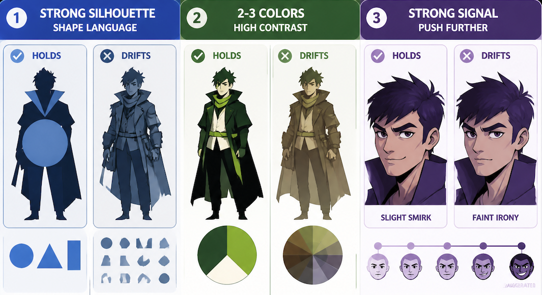
This is the trait AI video generation holds most reliably — which is exactly why silhouette clarity is treated as a foundational test in professional animation studios before designs move forward. A distinctive silhouette gives the model a structural anchor: rounded versus angular, compact versus tall, broad versus narrow. These read as shape data the model uses to reconstruct the character consistently.
What drifts: fine texture details, secondary accessories not prominent in the foreground, layered elements that overlap in complex ways. What holds: big structural shapes, distinctive proportions, unambiguous edges.
Push the silhouette further than you think you need to. Shape language — using circles, triangles, and rectangles deliberately to encode personality — gives the model clearer signal than generic humanoid proportions.
Color Palette
Color holds well, but only when it's high-contrast and structurally simple. A character with three distinct, saturated colors in clear zones generates more consistently than a sophisticated layered palette of seven related tones.
The model reads overall color distribution early in the generation process. If that distribution is clear, it anchors everything else. Limit your primary palette to two or three colors. Use your accent color consistently on a single prominent element — a scarf, a jacket — so it acts as a stable reference point. Avoid gradients as dominant elements; flat fills reconstruct more reliably.
One observation across multiple runs: warm desaturated palettes drift more than cool saturated ones. It happened consistently enough that it changed how I approach color for characters I plan to reuse. Color communicates before any other detail lands — if that signal is ambiguous at the distribution level, everything downstream drifts with it.
Face and Expression Cues
Expression type holds better than expression degree. If your character design communicates "slight smirk" through strong mouth asymmetry, that tends to survive. If it communicates "faint irony" through subtle muscle tension, that's gone by the second generation.
If an expression is important to the character's identity, it needs to be legible at low resolution and in silhouette — not just readable when you're looking carefully. Push it until you think you've gone too far, then stay there. Secondary note: expressions that are internally consistent with a character's silhouette and proportion hold better. A sharp angular face with a soft gentle expression creates a signal conflict the model resolves differently each time.
Character Design Workflow for Creators
The test for AI workflows isn't "does this look right." It's "does this still look right on the fourth generation."
Create Reference Images
Start with one clean, front-facing image against a neutral background — no strong environmental lighting, no busy scene. Then build a small set: the same character from a three-quarter angle, and one image foregrounding the most distinctive color element. Three images is usually enough.
Keep your reference set internally consistent. Images from different artistic styles or lighting conditions make the model average them — and the average is often wrong.
Save stable references to My References so you can reuse the same anchors across sessions without re-uploading. For production workflows, tools like the One Click Video Generator help keep those reference anchors consistent across multiple generations in a series pipeline.

Test in Motion
Run a simple motion prompt before committing to a full project — walking, turning, one expressive gesture. Watch for: edge drift (silhouette softens during motion), expression collapse (designed expression flattens to neutral as the character moves), and texture slide (clothing details shift between frames).
If the silhouette holds through a full rotation and color zones stay clean, the character is ready for more complex prompts. If either breaks, simplify the reference image — fewer elements, higher contrast, stronger outline.
Build a Reusable Prompt Sheet
Without a prompt sheet, you start paraphrasing your character description after three clips and the model interprets the paraphrase differently each time. Four things to document:
- One sentence describing the dominant silhouette
- The two or three primary color zones and their tones
- The expression descriptor (specific — "slight downward set of the mouth," not "serious")
- The single most distinctive feature that must appear in every clip
Use this verbatim alongside your Reference to Video inputs. The combination of anchored reference images and consistent prompt language is where stability actually comes from. Keep the prompt short — long descriptions give the model more variables to drift on, not more constraints to hold.
Mistakes to Avoid
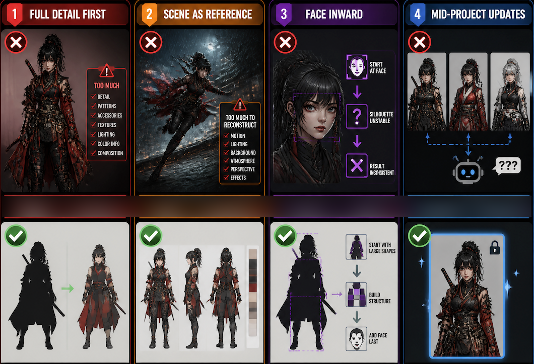
Designing at full detail first, then extracting a reference. A fully realized detailed design often has too much information for a generation system to anchor. Start with silhouette and color zones. Add detail only after those generate stably.
Using a scene image as a reference. A reference where the character is in motion or complex lighting gives the model too much to reconstruct. The reference image's job is to anchor the character, not to show them doing something interesting.
Solving from the face inward. If the silhouette isn't holding, the face definitely won't. Work from large shapes inward, not face outward.
Updating the character mid-project. You change a color slightly, improve a detail. Now your reference images are inconsistent with each other, and the model doesn't know which version is canonical. Commit to the design before generating clips you plan to keep.